GI-ESCR Logo Redesign Stylescape
Option 3
This is the most complex logo option you’ll see. We keep the circle and leaf, but add some dynamism to the shapes, so they look like they’re moving. The shapes still alude to the letters G+I, and in this case, we have an interesting juxtaposition of up/down movement. The leaf may point down, but the overall movement goes up. This insinuates the up-down dynamic between right-holders and policy-makers.
NOTES:
>> The tone of blue is steady, professional & trustworthy.
>> The tone of green is bright & energetic.
>> The sans-serif font gives the brand a modern, younger look.
>> Fun fact: sans-serif fonts are easier to read for people with dyslexia, dyscalculia, and visibility issues, which makes it a more universal type of font.
Logo variations
Suggestion:
Since the name is widely known as “GI” this could be the ideal time to rebrand to a shorter version of the name, which is easier to remember (and pronounce!)
Easy to recognise.
Easy to scale.
Scalability:
Since the green is very bright, it doesn’t contrast enough with the white in very small applications. The favicon must be created without the green inside the leaf.
Key Elements Checklist
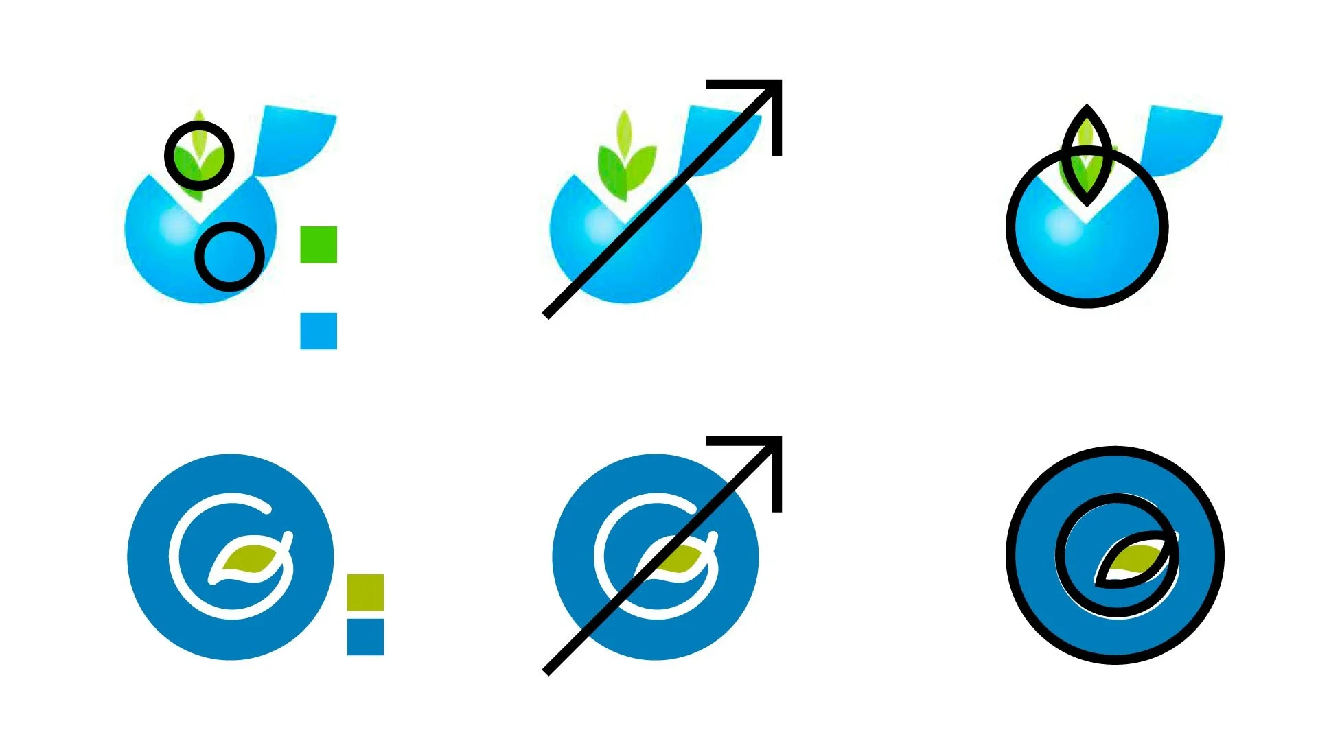
Checklist:
Colours: green & blue
Accent to the top right corner
Shape combines circle and leaf
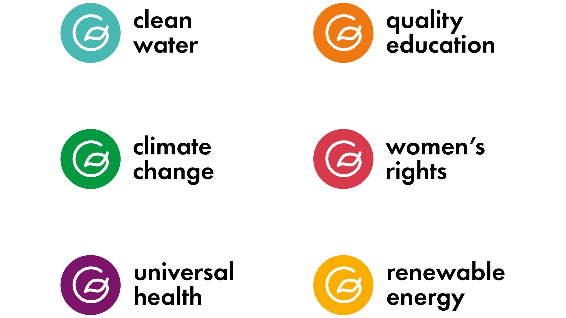
Project Branding

Woohoo!
With this logo, you can even brand your individual projects or areas of work!