GI-ESCR Logo Redesign Stylescape
Option 2
This option is a slightly more complex version of all key elements. While we keep the circle and leaf, a new circular shape is added in, which gives us an identifiable G+I. This shape can also be seen as an arrow, symbolising the constant transformation of all three areas of work: economy, society and culture. Finally, the asymmetry symbolises GI’s evidence-based approach - reality, is never perfect or symmetrical.
NOTES:
>> The tone of blue is steady, professional & trustworthy.
>> The tone of green is bright & energetic.
>> The sans-serif font gives the brand a modern, younger look.
>> Fun fact: sans-serif fonts are easier to read for people with dyslexia, dyscalculia, and visibility issues, which makes it a more universal type of font.
Logo variations
Suggestion:
Since the name is widely known as “GI” this could be the ideal time to rebrand to a shorter version of the name, which is easier to remember (and pronounce!)
Easy to recognise.
Easy to scale.
Scalability:
Very small applications require a simplification of the leaf, from 2 colours to 1.
Key Elements Checklist
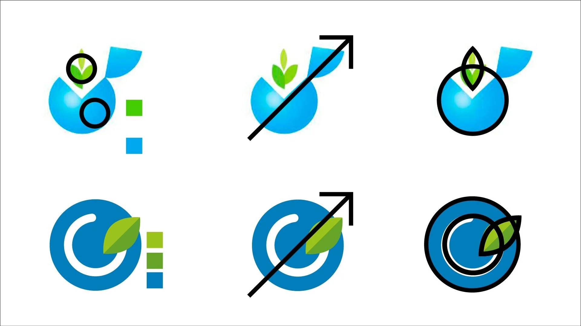
Checklist:
Colours: green & blue
Accent to the top right corner
Shape combines circle and leaf
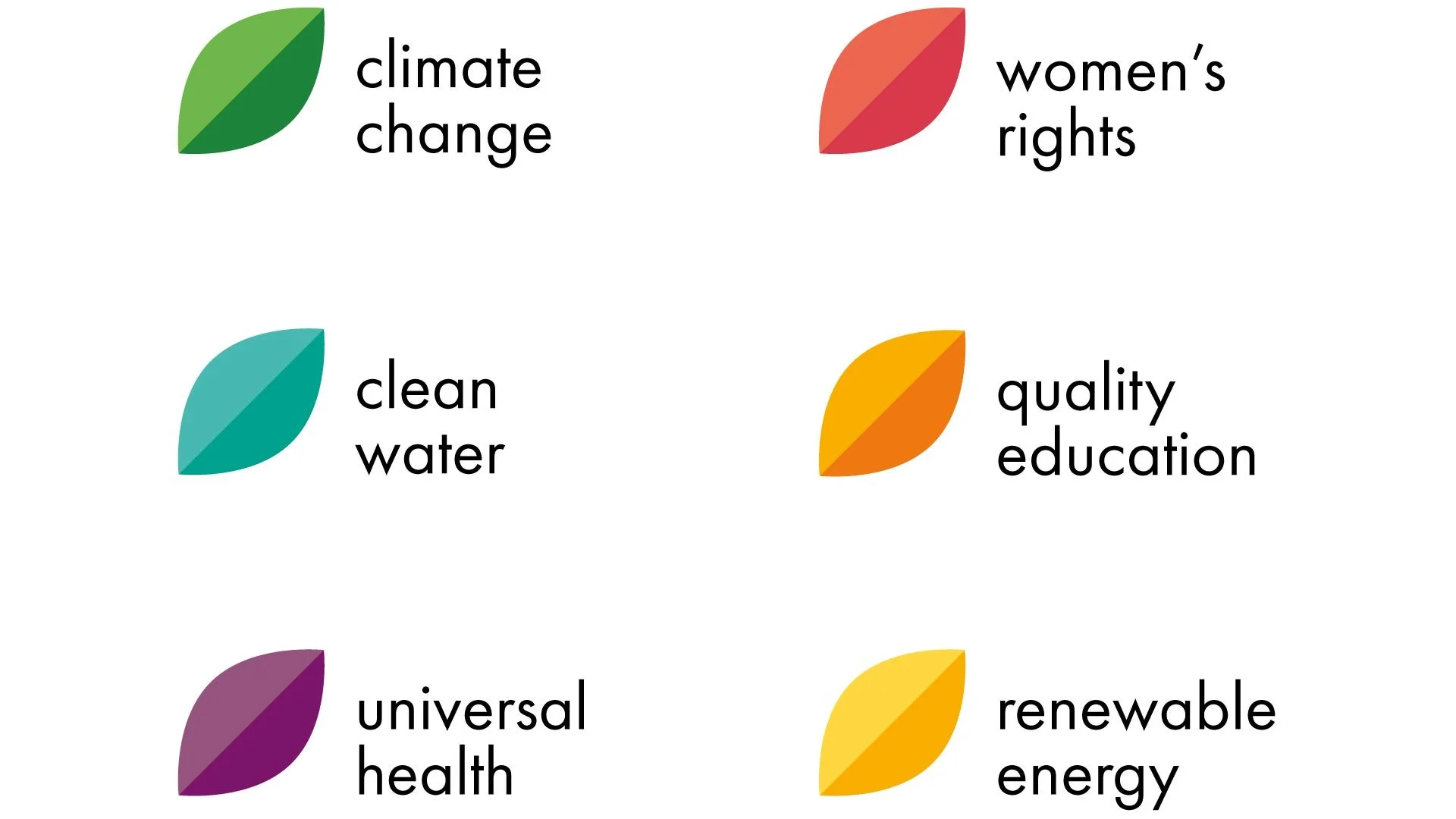
Project Branding

Woohoo!
With this logo, you can even brand your individual projects or areas of work!