GI-ESCR Logo Redesign Stylescape
Option 1
This option is a very simplified version of all key elements. This means that the shapes and colours are very easily recognisable. We stay as true as possible to the roots and essence of the original logo.
NOTES:
>> The tone of blue is steady, professional & trustworthy.
>> The tone of green is bright & energetic.
>> The sans-serif font gives the brand a modern, younger look.
>> Fun fact: sans-serif fonts are easier to read for people with dyslexia, dyscalculia, and visibility issues, which makes it a more universal type of font.
Logo variations
Suggestion:
Since the name is widely known as “GI” this could be the ideal time to rebrand to a shorter version of the name, which is easier to remember (and pronounce!)
Easy to recognise.
Easy to scale.
Fun fact:
Even the smallest application of the logo (the favicon) requires no modification from the original shape.
Key Elements Checklist
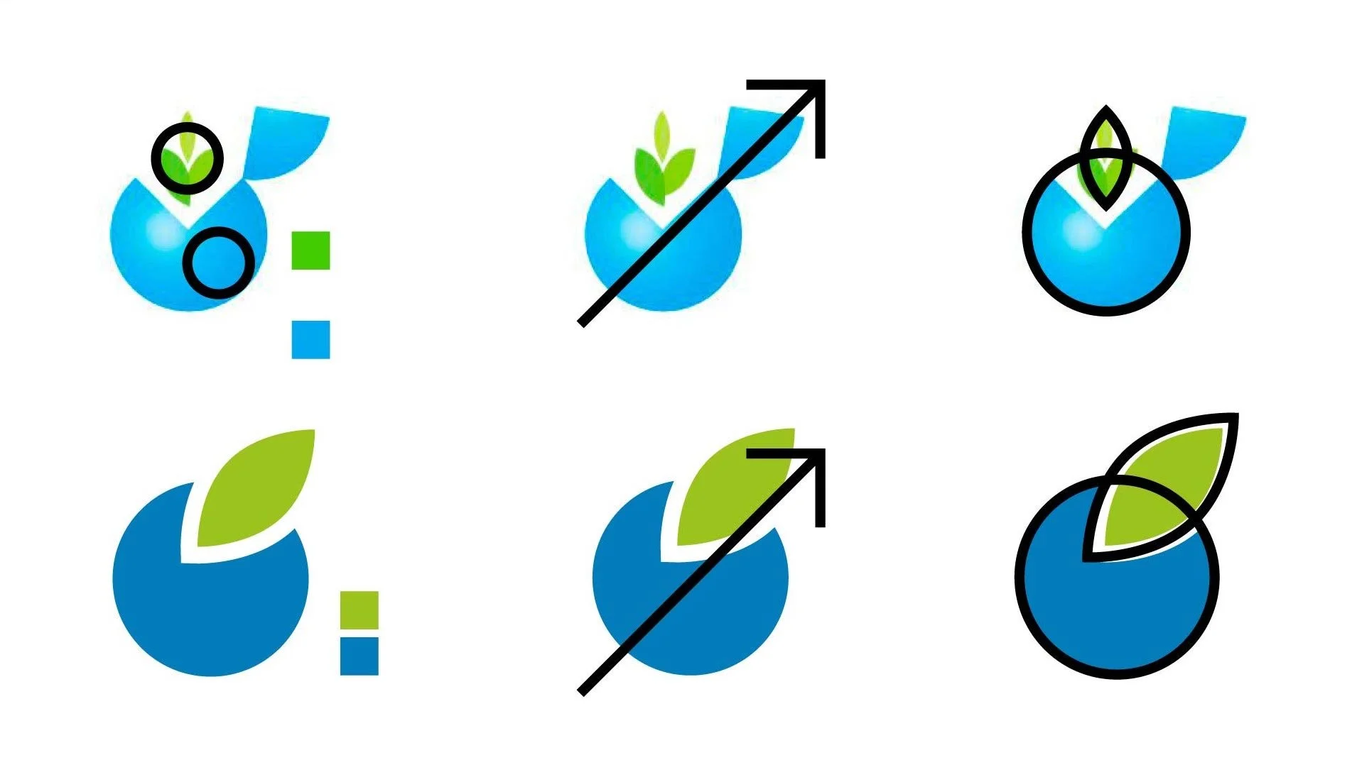
Checklist:
Colours: green & blue
Accent to the top right corner
Shape combines circle and leaf
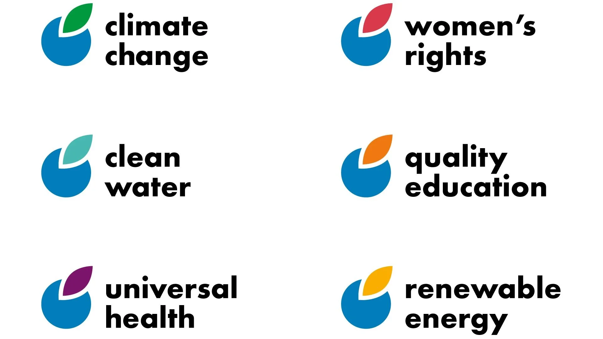
Project Branding

Woohoo!
With this logo, you can even brand your individual projects or areas of work!